Soft colors: useful, but not if they’re spilling everywhere
Hi everyone, Julie here. To enjoy soft colors without overwhelming the room, choose a dominant shade, limit pastel tones to a few accents, and keep some areas neutral. This simple rule brings a sense of calm without erasing the character of your home. The secret lies in moderation, contrast, and a balanced palette.
What to prioritize:
- Choose one main color for the room.
- Pair it with two neutral shades, such as cream and light wood.
- Reserve pastel tones for textiles or a single accent wall.
- Keep surfaces clear to preserve visual clarity.
- Add a pop of color, then see how it looks in daylight.
Start by looking at the elements already in the room: the floor, curtains, sofa, and furniture. Once you’ve identified this foundation, you can create visual harmony without adding lots of colors; these ideas for creating a cozy atmosphere without making it feel dark and for creating a soft yet lively haven can help you choose your color combinations.
Soft colors: finding the right balance in every room
A gentle shade often creates a more soothing atmosphere, but its effect depends on how much you use and the light. Sage green can envelop a reading nook, while warm beige easily brings an open-plan living area together.
If it’s a small room with little natural light, choose a light shade for the walls and more saturated details. If it’s a space that’s already very neutral, add a pop of color on a cushion, a lamp, or an artwork rather than repainting every surface.
A balanced palette, not a collection of shades
To keep your decor easy on the eye, start with a dominant color, add a secondary shade, and finish with a contrasting accent. The contrast can come from a dark frame, a wooden piece of furniture, or a textile with a subtle pattern.
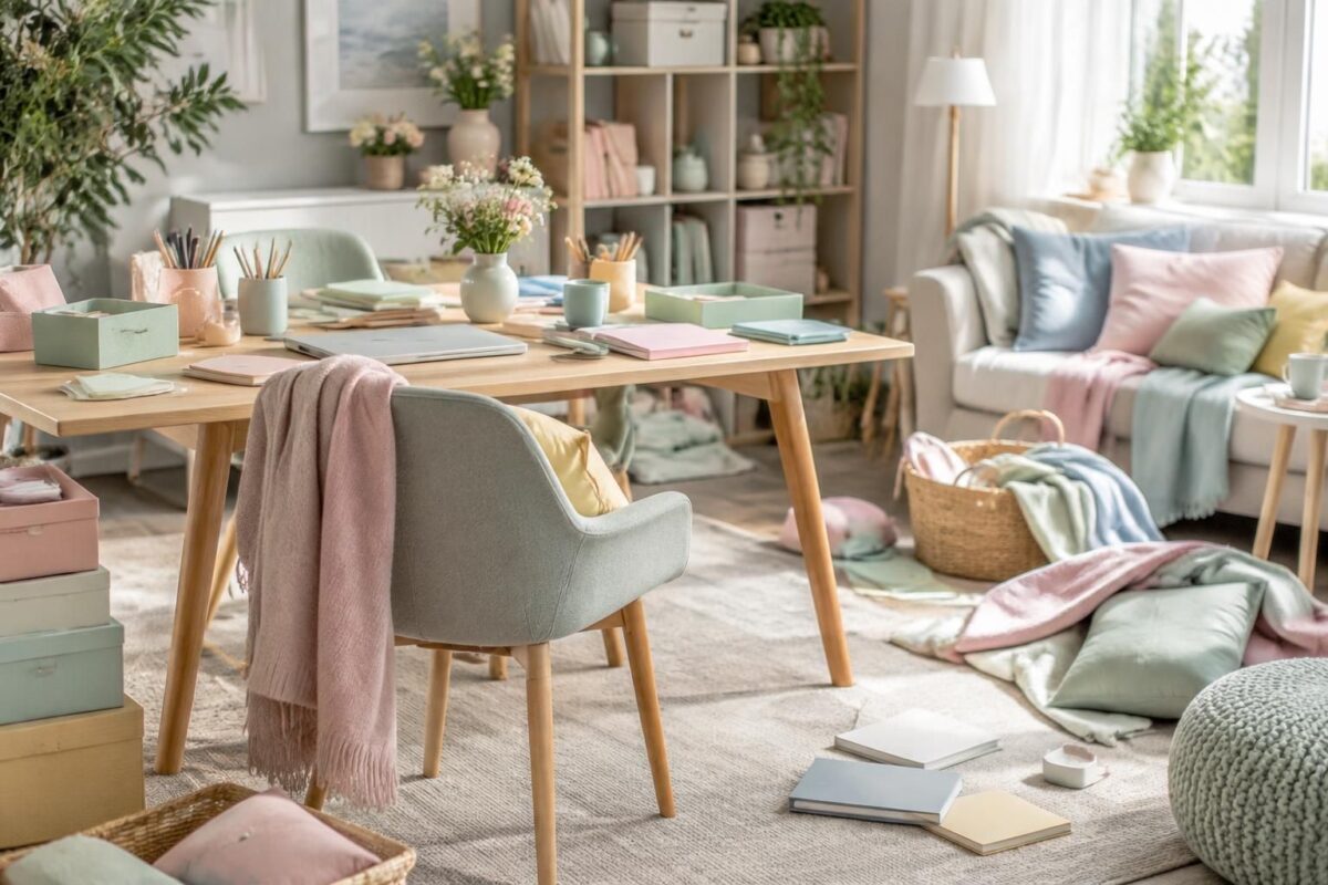
A friend had chosen powder pink, sky blue, and aqua green for her living room. By removing two accessories and keeping the pink on the cushions, she brought a calmer feel to the room without losing its personality.
“A soft color stands out more when it has space around it.” This idea sums up the appeal of simplicity: letting the walls and furniture breathe makes every detail feel more intentional.
How to combine pastel tones without cluttering your decor
Pastel tones work well when supported by natural materials and neutral shades. Linen, light wood, matte ceramics, and wool add texture without introducing another bold color.
Avoid repeating the same shade on every object. Echoing it on two or three pieces is often enough to create a sense of continuity; beyond that, it can become hard for the eye to distinguish between areas and objects.
| Situation | Color choice | Suggested amount |
|---|---|---|
| Room with little natural light | Cream, light beige, or very soft green | Use a light shade as the base, with a more saturated color as a small accent |
| Living room that’s already neutral | Powder pink or pale blue | A few coordinated accessories |
| Relaxation nook | Sage green or gray-blue | One dominant color and natural materials |
A simple three-step method
- Step 1: Take note of the room’s light and the colors that won’t change, such as the floor or the large sofa.
- Step 2: Choose a main color and test it on a sample at different times of day.
- Step 3: Add a few accessories, then remove any that disrupt the overall look or draw too much attention.
This method helps you avoid impulse purchases and lets you judge the shade in its actual setting. Moderation doesn’t mean bland decor; on the contrary, it gives the elements you choose more impact.
Soft decor that still has depth
To avoid a monotonous look, play with materials and shapes before adding more colors. A textured rug, a wooden table, or a ceramic vase adds depth while keeping the design pared back.
Decorative objects also look better when arranged in small groupings. Three pieces of different sizes on a shelf often look more cohesive than items scattered throughout the room.
Keep this rule of thumb in mind: if every surface draws the eye, nothing really stands out. Leave a calm space around your pop of color to give it the attention it deserves.
Frequently asked questions about soft colors
How many soft colors should you combine in one room?
Start with one dominant color and one or two complementary shades. Natural materials or a more saturated accent can complete the look without adding lots of pastel tones.
Are pastel colors suitable for a small room?
Yes. In a room with little natural light, choose a light shade and reserve more intense colors for small accessories to preserve a sense of space.
How can you keep soft decor from looking bland?
Focus on textures, shapes, and subtle contrast. Wood, linen, or a more colorful lamp adds depth without cluttering the palette.
Should you paint all the walls the same color?
Not necessarily. A single colored wall or a few textile accents are often enough to create a soft atmosphere, especially if the room is already small or cluttered.
Thanks for reading, Julie. P.S. Leave a comment; I’ll reply as soon as I can!